You can control the visibility of specific elements widgets or containers based on the visitor’s screen size (Desktop, Tablet, or Mobile).
Note
Configuration steps vary depending on whether you are using Elementor v4 (Atomic Editor) or Elementor v3 (Classic Widgets).
Elementor v4 (Atomic Editor)
In the Atomic Editor, layout display properties are responsive per device breakpoint:
- In the top bar of the Elementor Editor, click the Responsive Mode icon and switch to your target device view (such as Mobile or Tablet).

- Select the Container or Element on the canvas or in the Structure panel.
- In the left panel, click the Style tab and expand the Layout section.
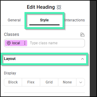
- Set the Display option to None.
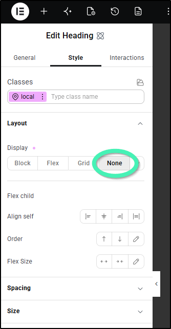
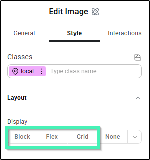
Tip: Setting Display: None while in a mobile preview hides the element for that specific device. To re-enable a hidden element later, use the Structure panel to select the element, switch back to that device view, and set Display to Flex, Block, or Grid.
Note: The Display Conditions setting under General > Settings is used for dynamic criteria like User Roles, Page Titles, or Dates – not screen breakpoints.
Elementor v3 (Classic Widgets)
For Elementor v3 widgets and containers, responsive visibility controls are located directly within the Advanced panel.
- Open a page in the Elementor Editor.
- Select the Container or Widget you want to edit.
- In the left panel, navigate to the Advanced tab and expand the Responsive section.
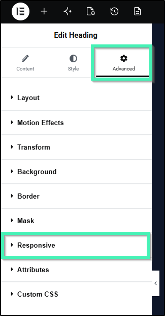
- Use the toggles to adjust visibility:
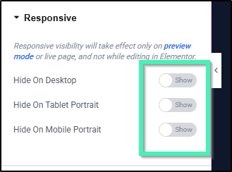
- Hide On Desktop: Show / Hide
- Hide On Tablet: Show / Hide
- Hide On Mobile: Show / Hide