Setting an element or widget to a Fixed position locks it relative to the browser viewport. As visitors scroll through the page, the item remains pinned in the exact same position on the screen – making it ideal for floating action buttons, back-to-top arrows, or persistent callouts.
Setting a Fixed Position
The navigation path depends on whether you are using Elementor v4 (Atomic Editor) or Elementor v3 (Widgets).
Elementor v4 (Atomic Editor)
- Select the element on your page canvas.
- In the left panel, navigate to the Style tab.
- Click to expand the Position section and set the Position dropdown to Fixed.
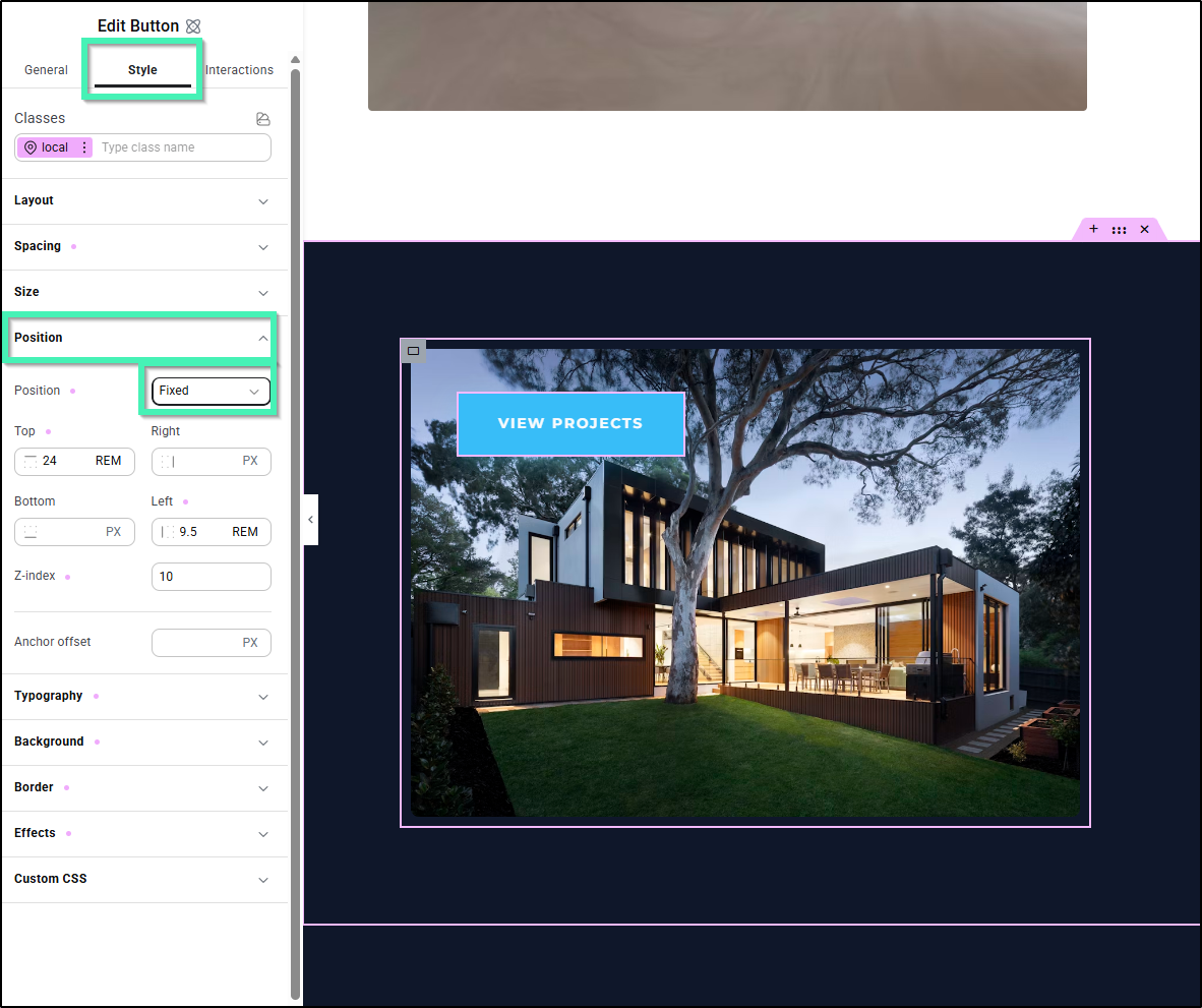
- Adjust placement by entering values for Top, Right, Bottom, or Left (using units such as
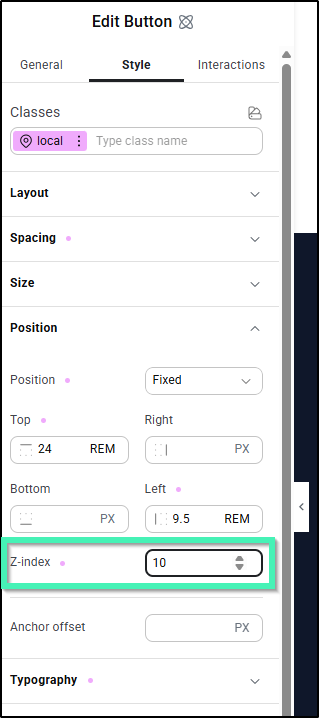
PXorREM). - (Optional) Set the Z-index value to control layer stacking relative to other page elements.
Elementor v3 (Widgets)
- Select the widget on your page canvas.
- In the left panel, navigate to the Advanced tab.
- Click to expand the Layout section and set the Position dropdown to Fixed.
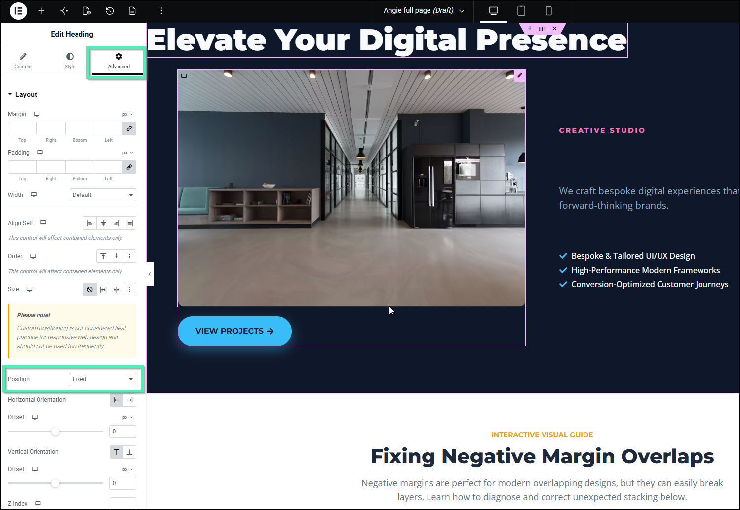
- Choose your alignment using the Horizontal Orientation and Vertical Orientation toggles, then adjust the Offset sliders (or click and drag the element directly on the page using the drag handles).
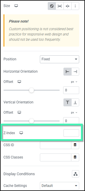
- (Optional) Set the Z-Index value to manage layering.
Best Practices & Tips
Fixed vs. Sticky: What’s the difference?
- Fixed Position: Positioned relative to the user’s viewport (screen). The element remains in the same spot on the screen regardless of page scrolling.
- Sticky Position: Positioned relative to its parent container/section. The element scrolls normally until it reaches a designated threshold, then “sticks” within the boundaries of its parent container.
NoteCustom positioning should be used selectively. Always preview your design across Desktop, Tablet, and Mobile views to ensure fixed elements do not overlap or obscure essential content on smaller screens.